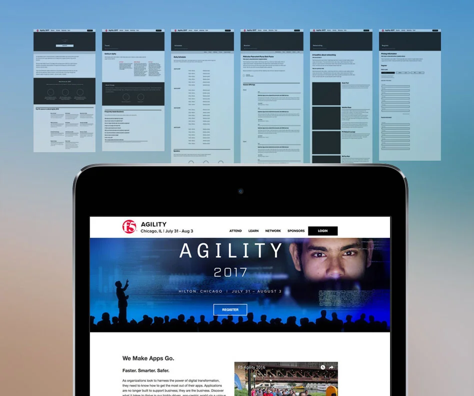
Hour 0
With short timelines I am limited in reviews. We began the process by researching the market by reviewing navigation of similar event sites. I needed to know how were others setting up their sites, what did our event team want and what might our end user want.
With the white boarding help of a coworker we suggested the main navigation contain information about the schedule, the speakers, the after parties, the location and registration. With some back and forth of stakeholder desires, the navigation became:
Attend (which included a quick overview, reasons to attend, FAQ and about the location)
Learn (information about sessions and speakers)
Network (about the solutions expo, the extra events and the closing party)
Sponsors (a required page in order to run the event even if it is not the most important for the user)
Register
I laid out the first draft copy into a prototype, wireframes would be preferred but with our timeline was not an option. My stakeholder and I sat down to review the pages.
Hour 7
With back and fourth about what was wanted my various managers and the company and what the user might want and be looking for we negotiated.
Once our content was locked down I played with the design to allow the content to be shown in a way that was easy to skim and read, visually interesting, and easy to develop under a quick timeline as well.
Using Adobe XD I created a higher fidelity prototype site to test the designs within ourselves. Once stakeholders were able to review and with another round of changes we finalized our designs.
Hour 18
Presenting to the Director did not go as planned. The requirements that were communicated to me had never been signed off on at her level. After listening to her feedback I learned that her major complaint is that she wanted something more captivating.
Presenting to the Director did not go as planned. The requirements that were communicated to me had never been signed off on at her level. After listening to her feedback I learned that her major complaint is that she wanted animation, something more visually captivating and different. Remember I now have 6 hours left. I made some suggestions but everything extended the timeline. I proposed extending the timeline by 8 hours in order to deliver a change that would suit her, redlines and cut images for development.
With approval I created a cinemagraph to play as the header image. This creates some additional interest that the director was looking for without extra development time.


