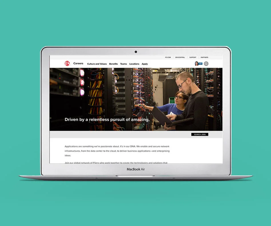
When someone went to apply a job at F5 the whole process was painful. The application system that F5 used was outdated and the page of content buried it and surfaced information that some in the company wanted surfaced but that many doubted applicants cared about. As our HR department upgraded their applicant system a small team and I as the lead designer were able to finally work on recreating a dark spot on the website the careers page.
The new design reduced the bounce rate from 65% to 16% and increased time on page by 112 seconds.
The team and information gathering
Determining what is in and out of scope is so crucial to a project and so easy to skip. Outlining the intent of the project what would be addressed and what would be out of scope due to restriction of time and recourses set expectations. The team of a project manager a lead copywriter, myself the lead designer and a manager for the web development team were able to sit down with stakeholders and discover what they were being asked by applicants, what the needs of the recruiters were and what image and messages the HR department wanted to show. Then we agreed to reviews and a timeline was created.
Planning the Architecture
With meetings between our team members and HR we started to separate our information into 4 buckets: why F5, teams, locations and the job search / application process.
Whiteboarding
In tandem to creating mood boards and a visual style I sat down and began white boarding. My main goal was to find ways to lay out the page to present the branded story that the company wanted to create while allowing people to both access the content that they wanted.
Mood Boards
The design of the microsite needed to fit within the whole of F5 however it could push the envelope more then typical. I played with and then created 4 individual design styles and presented moodboards to the team of which they selected 3 to present to management. Of these one was selected, allowing for final layout.
Prototyping
I continued from sketches to low fidelity prototypes made in balsamiq then noticed that people were struggling understanding the intents of the page with filler text and missing images the the low fi prototype contained so I built out high fidelity prototypes with a design style that was not under consideration. I was working concurrently on moodboards and design style. I didn't want images or illustrations to be locked down when looking at prototypes so We kept it stylized and used a disclaimer before presenting the prototypes.
Visual Design
Before designing the final layout I met with our developers insuring that all functionality that we were using could be built within the timeline. With the go ahead I laid out the designs in photoshop. We tweaked met, tested and iterated again.
Photography
The moodboard that was selected was a focus was described as:
“A sense of place, activity and rich editorial photography helps us tell our people-centric “we build tomorrow” story”
For that we needed high quality photos that showed us, in our offices doing our jobs. We put a call out and scheduled volunteers for shoots and spent a full day shooting everything we might need. I brought my camera and went to work as a photographer. Then selecting and editing photos built a small library of images that we had of our employees.
Final approval
I presented on June 29th received signoff on the designs. Our team was incredibly proud of the work we had done. I would have loved to include actual job applicants in a research phase and a prototyping phase but as we were limited in both time and budget we worked with what we had and have been able to see results from it.
Impact to the company
Traffic to the page in the later half of October had increased 7.25% from that date range the prior year, the real wins became that the bounce rate improved from a 65% bounce rate to a 16% rate with the average time on page increasing from 40 to 152 seconds, a 308% increase.


